
A direct-to-consumer computer device retailer wondered why most visitors to their e-commerce site bounced out in 3 seconds or less. When we interviewed consumers in our eye-tracking lab after a simulated online shopping task, it was a no-brainer. Their first impression? Not good.
-The site didn’t feel trustworthy.
-Flashy sales banners and overwhelming discounts created confusion.
-The clutter was simply too much to handle.
Before reading a single word, visitors subconsciously ask: Is this site trustworthy? Is it worth my time? These snap judgments—known as thin-slicing—happen in an instant and are driven by subtle cues.
First impressions matter. Your website has just seconds to communicate trust and clarity. The right messaging, clean design, and intuitive layout can mean the difference between a visitor who stays—or one who clicks away.


Getting past the first impression is a win, but the journey isn’t over. When users visit a site with a goal in mind, they don’t leisurely read—they scan.
This has big implications for design and content strategy: Navigation must be intuitive—don’t make users think! Content should be layered with headlines, subheadings, bullet points, and links for deeper exploration.
If all goes well, two things might happen. The user finds value and digs deeper for more information. Or, the site captures their interest, shifting them from task mode to surfing mode, where browsing becomes effortless and even fun.
Making a website easy to use is table stakes. But an intuitive experience isn’t the same as an engaging one. Marketers want customers to linger, explore, and build a relationship with the brand. The longer visitors stay, the higher the chances they’ll convert.
Websites are powerful brand-building platforms—far more effective than a fleeting TV ad. Think about it: a TV spot costs a fortune for 30 seconds of exposure to a disengaged audience. Meanwhile, your website attracts people who want to be there. They’re actively searching for information or solutions. So why do so many sites act like glorified transaction portals, shoving users out the door as quickly as possible? What a waste of valuable brand-building time!


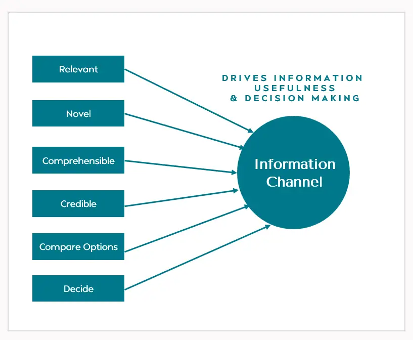
Most websites overload users with endless text, marketing fluff, and irrelevant details. Instead, content should be relevant, credible, digestible, and fresh. If visitors can’t find what they need—quickly—they’re gone. Worse, they might end up on a competitor’s site that does a better job of educating and guiding them.
Understanding user intent is key. Some people visit to gather knowledge, others to gain confidence before deciding. Your site must cater to both by providing clear comparisons, simple explanations, and reassurance. Otherwise, frustration wins, and conversion rates plummet.
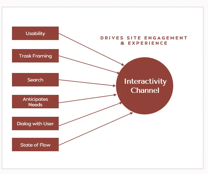
Great interactivity isn’t about flashy animations or gimmicks—it’s about creating an effortless, almost invisible experience. Visitors should instantly understand what the site offers and move through it seamlessly.
A well-structured homepage, intuitive navigation, smart filtering, and efficient search tools help users enter a state of “flow.” This is where they lose track of time and become absorbed in the experience. Disrupt this flow with unnecessary distractions, and they’ll bounce.
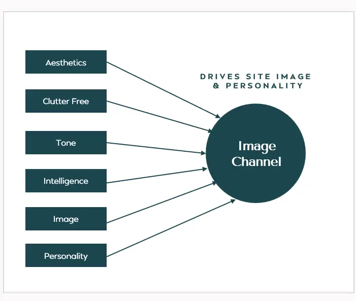
Here’s a truth most brands ignore: users react to websites like they do to people. We’ve all cursed a frustrating site that just “doesn’t get it.” On the flip side, we’ve also described sites as “smart,” “sleek,” or “trustworthy.”
First impressions are everything. In just a few seconds, visitors decide if your site feels upscale or cheap, credible or sketchy, helpful or frustrating.
Every detail matters: fonts, colors, imagery, tone, and messaging. A cold and transactional website can turn off users.

You need to book a flight. You open an app with a sleek design, a bold “Book Now” button, and a seamless checkout process. But something feels… off. No airline ratings. No baggage policy details. No clear refund rules. It looks smooth, but can you trust it? You hesitate, check another app, and end up booking elsewhere.
This is where many digital experiences fail. You are not just looking for a quick purchase—you are looking for confidence in a branded product.
You scan for credibility, pick up on signals of reliability, and build trust with every tap.
What works? A system, not just a booking button. Smart interactivity keeps you engaged. The right details appear when you need them. When an app consistently delivers trust, transparency, and ease, it does more than drive bookings—it builds brand equity. A seamless experience today creates confidence for tomorrow, turning one-time users into loyal advocates who choose, recommend, and return.
There is many a slip between the shopping cart and the credit card!
The path to conversion on a website is often filled with obstacles. But remember—the job isn’t done until it’s done! Every digital asset, whether an e-commerce site or an information site, must have a clear goal: conversion.
For an e-commerce site, the objective is straightforward—get customers to add products to their cart, complete payment, and finalize the transaction. But what about information-based sites? A cancer hospital’s website, for example, might aim to encourage preventative health behaviors, while an insurance comparison site may want visitors to apply for insurance directly.
The shift from browsing to taking action doesn’t happen instantly—it’s a process.
Users move through multiple stages before converting, and each step requires careful planning. They must trust the site’s credibility, feel confident in their decisions, and have a clear understanding of what to do next. If options are overwhelming, they need intelligent guidance to narrow them down. Any hidden concerns should be addressed proactively, reassuring visitors that they are making the right choice.
Psychological nudges play a crucial role in this journey. Incentives, whether subtle or explicit, can push users toward action. A seamless and well-structured experience ensures they don’t abandon the process midway. Conversion isn’t just about ease of use; it’s about strategic guidance that leads visitors to act.
A website’s job isn’t just to provide information—it must actively drive results. To succeed, businesses must think beyond usability and focus on creating an experience that persuades, reassures, and ultimately converts.